Add Lightbox to React


Table of Contents
§ Growing and Centered Image List
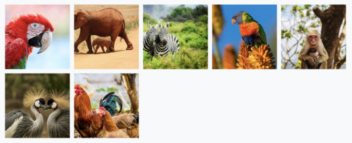
The nice thing about using GraphQL is that when we pull our image data, we can pull a small proportional thumbnail and a full size version of the image for when they open the lightbox.
export const portfolioQuery = graphql`
  query CompImages {
    allFile(filter: { relativeDirectory: { eq: "portfolio" } }) {
      edges {
        node {
          id
          childImageSharp {
            thumb: gatsbyImageData(
              width: 175
              height: 175
              placeholder: BLURRED
              formats: [AUTO, WEBP, AVIF]
            )
            full: gatsbyImageData(layout: FULL_WIDTH)
          }
        }
      }
    }
  }
`;
The initial div uses Bootstrap's built in styles d-flex and flex-wrap to make the div a Flexbox which wraps. Then when we cycle through each image, we can contain them in a component we'll call ImgColWrapper.
  <div
    className="d-flex flex-wrap"
    style={{ margin: rowMargin + 'px' }}
  >
    {images.map(
      (img: { thumb: IGatsbyImageData }, imgIndex: number) => {
        const thumbImage = getImage(img.thumb);
        if (!thumbImage) {
          return null;
        }
        return (
          <ImgColWrapper
            key={imgIndex}
            gutter={gutter}
            onClick={() => {
              setIsOpen(true);
              setIndex(imgIndex);
            }}
          >
            <GatsbyImage image={thumbImage} alt={`library image`} />
          </ImgColWrapper>
        );
      },
    )}
  </div>
The ImgColWrapper component wraps each image in another Flexbox. Each is wrapped in another div with a classname of imageColumn.
// ImageColWrapper.tsx
import React from 'react';
import './ImageColWrapper.scss';

interface ImageColWrapperProps {
  children?: React.ReactNode;
  onClick: () => void;
  gutter: string;
}

const ImageColWrapper = ({
  children,
  onClick,
  gutter,
}: ImageColWrapperProps) => {
  return (
    <div className="imageColumn" onClick={onClick}>
      <div
        className="d-flex flex-grow-0 flex-shrink-0 align-items-center justify-content-center"
        style={{ margin: gutter }}
      >
        {children}
      </div>
    </div>
  );
};

export default ImageColWrapper;
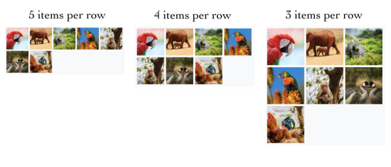
The imageColumn uses these styles to keep each column centered, whether 3, 4, or 5 images are in a row. We use Bootstrap breakpoints to set when the proportions change.
@import 'styles/dominant/bootstrap-custom.scss';

.imageColumn {
  flex-basis: 33%;
  max-width: 33%;
  @include media-breakpoint-up(sm) {
    flex-basis: 25%;
    max-width: 25%;
  }
  @include media-breakpoint-up(lg) {
    flex-basis: 20%;
    max-width: 20%;
  }
}
§ Implementing LightBox
From our initial page, we can import react-image-lightbox and its corresponding CSS.
import React, { useState } from 'react';
import { graphql } from 'gatsby';
import { GatsbyImage, getImage, IGatsbyImageData } from 'gatsby-plugin-image';
import ImgColWrapper from '../wrappers/ImageColWrapper';
import Lightbox from 'react-image-lightbox';
import * as LightboxCSS from '@/styles/lightbox/lightbox.css';
import styled from 'styled-components';

interface CompPageProps {
  data: any;
  gutter: string;
  rowMargin: number;
  lightboxOptions: {};
  onClose: () => void;
}

const StyledLightbox = styled(Lightbox)`
  ${LightboxCSS}
`;

const CompPage: React.FC = ({
  data,
  gutter = '0.25rem',
  rowMargin = 0,
  lightboxOptions = {},
  onClose = () => {},
}: CompPageProps) => {
  const [index, setIndex] = useState(0);
  const [isOpen, setIsOpen] = useState(false);

  const images = data.allFile.edges.map(({ node }) => node.childImageSharp);

  const prevIndex = (index + images.length - 1) % images.length;
  const nextIndex = (index + images.length + 1) % images.length;

  // URLs for full width images
  const mainSrc = images[index]?.full?.images?.fallback?.src;
  const nextSrc = images[nextIndex]?.full?.images?.fallback?.src;
  const prevSrc = images[prevIndex]?.full?.images?.fallback?.src;

  const onCloseLightbox = () => {
    onClose();
    setIsOpen(false);
  };

  return (
    <div>
      <div className="homemade-container-sm mx-auto d-flex flex-column align-items-center">
        <div className="inner-container">
          <hr className="m-0" />
          <h1 className="pt-4">Lightbox Example</h1>
          <div className="pt-3">
            <div
              className="d-flex flex-wrap"
              style={{ margin: rowMargin + 'px' }}
            >
              {images.map(
                (img: { thumb: IGatsbyImageData }, imgIndex: number) => {
                  const thumbImage = getImage(img.thumb);
                  if (!thumbImage) {
                    return null;
                  }
                  return (
                    <ImgColWrapper
                      key={imgIndex}
                      gutter={gutter}
                      onClick={() => {
                        setIsOpen(true);
                        setIndex(imgIndex);
                      }}
                    >
                      <GatsbyImage image={thumbImage} alt={`testing`} />
                    </ImgColWrapper>
                  );
                },
              )}
            </div>
            {isOpen && (
              <Lightbox
                mainSrc={mainSrc || ''}
                nextSrc={nextSrc || ''}
                prevSrc={prevSrc || ''}
                onCloseRequest={onCloseLightbox}
                onMovePrevRequest={() => setIndex(prevIndex)}
                onMoveNextRequest={() => setIndex(nextIndex)}
                imageTitle={images[index].title}
                imageCaption={images[index].caption}
                {...lightboxOptions}
              />
            )}
          </div>
        </div>
      </div>
    </div>
  );
};

export default CompPage;

export const portfolioQuery = graphql`
  query CompImages {
    allFile(filter: { relativeDirectory: { eq: "lightbox" } }) {
      edges {
        node {
          id
          childImageSharp {
            thumb: gatsbyImageData(
              width: 175
              height: 175
              placeholder: BLURRED
              formats: [AUTO, WEBP, AVIF]
            )
            full: gatsbyImageData(layout: FULL_WIDTH)
          }
        }
      }
    }
  }
`;
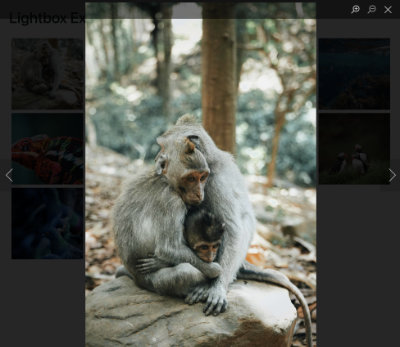
The Lightbox defaults still work quite nicely, so when we click on each image, or Lightbox should work quite well.
This tutorial is inspired by an implementation of react-image-lighthouse by Brownie Broke.